ZONE SECRÈTE
During my summer vacation, I decided to spice things up with my buddies by going camping. And guess what? We had this brilliant idea of leaving our cozy nest to embark on an escape game adventure. Yeah, I know, it makes no sense... But hey, let's roll with it.
So, why am I telling you this now? Well, it's all about the booking process. We had to go through their website and let me tell you, it was not a pleasant sight for my poor eyes.
So, during my free time, I thought to myself, "Why not put my design skills to good use by drawing inspiration from this escape game?" And guess what? I gave it a shot!
zone-secrete.com

The Concept
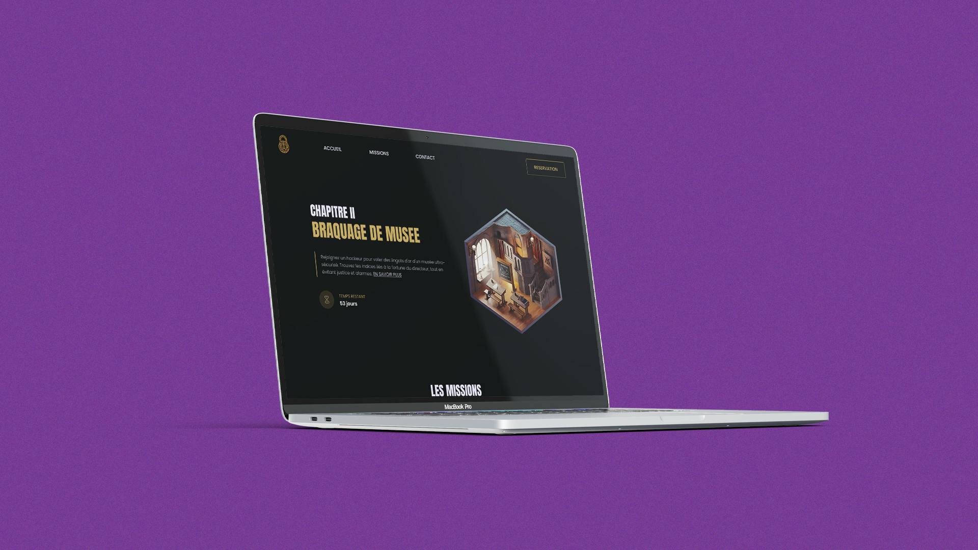
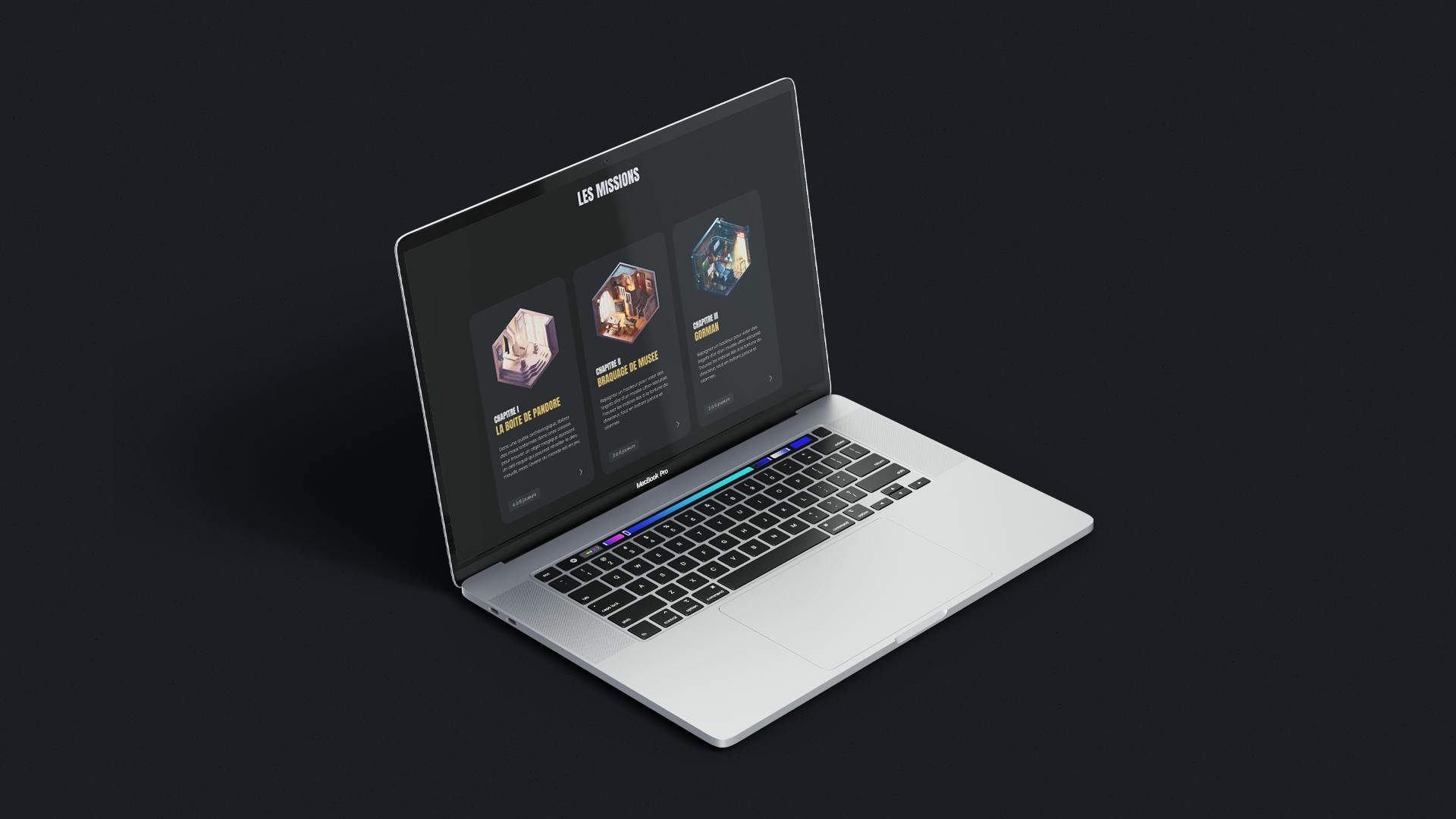
There are plenty of things about this site that didn't quite excite me. Firstly, the logo, honestly, it was lacking in excitement, you know? It looked more like a medieval crest than the fun vibe of an escape game. I thought about adding a bit more punch, with cards for each mission and featuring the current mission at the top of the page, as the main attraction!
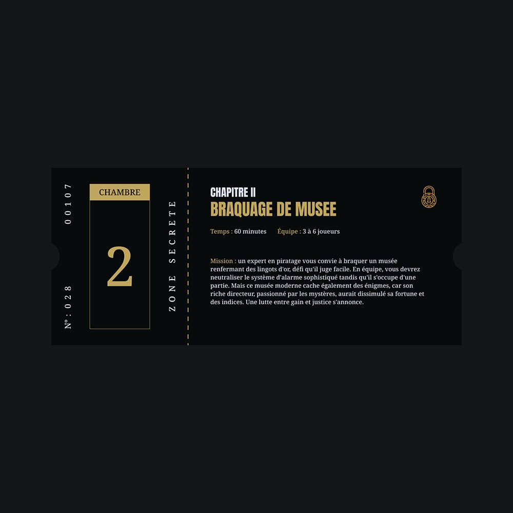
Speaking of which, do you think I should pitch the design to the creator of this escape game? See if they're up for an update? It could be quite the challenge, right? Oh, and I had this cool idea: personalized tickets! One for each player, for a keepsake alongside the end photo.
By the way, I hope I'm not getting too ahead of myself, but this experience was really top-notch! The guy behind this escape game really nailed it, it was truly awesome. Honestly, it's worth a visit!

